Cookoo
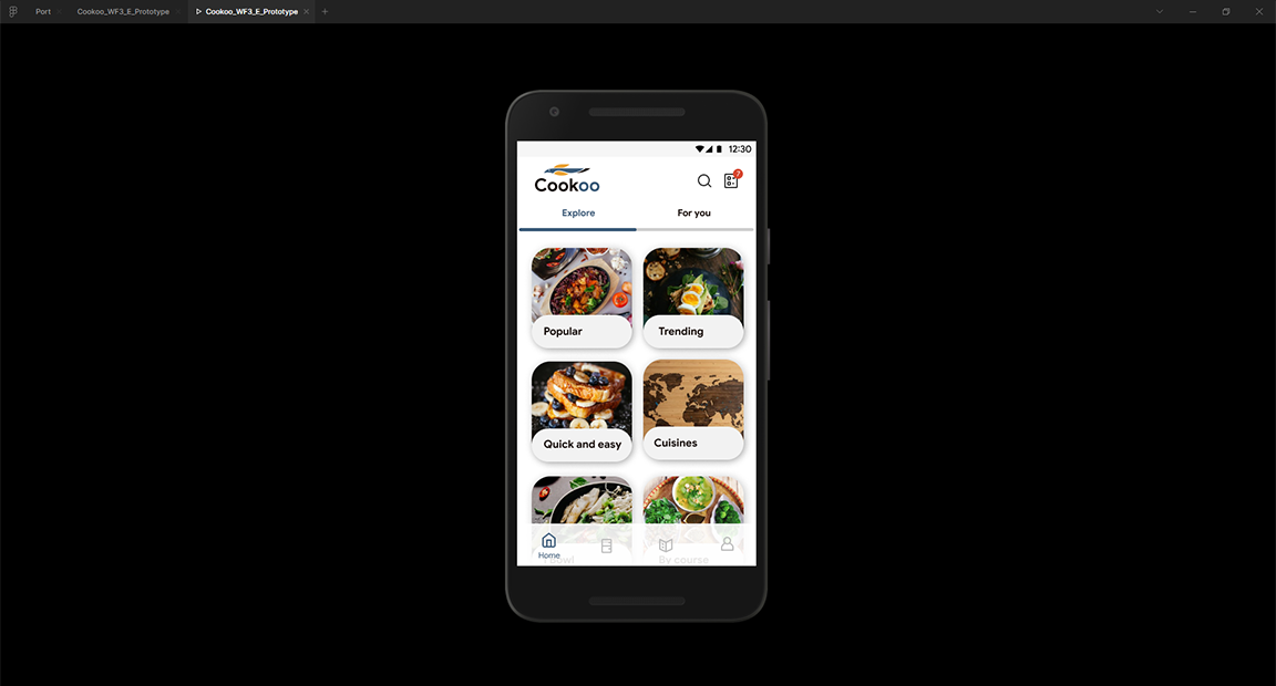
The Cookoo App was a daily cooking assitatnce, solving problems for making menu, storing food, and looking for recipes that includes more than 1 ingredient.
Team role
Our team had 2 members. I a team leader, User Researcher, UX designer, and Tran Le Son as UI and Graphic Designer.
How it started
There are a lot of people who cook, but people that we can help might not be professional. So we chose homecooks, which mostly are married woman due to our survey, who always lack of time for cooking.
The process lasted for approximately 4 months which cover the whole process of designing mobile application.
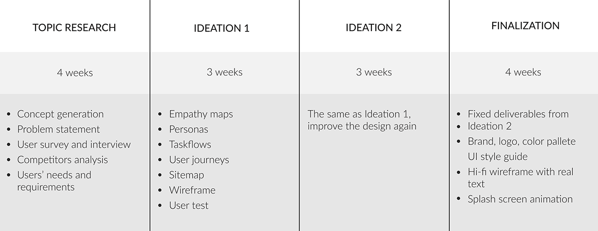
Cookoo process
The researches that effect most on the design and business model
There were 3 pieces of data that I considered to be crucial to Cookoo application: People potential interest in the app, how we’re gonna make this app profitable, and our competitors
1. Health becomes the #1 priority of people in Vietnam
Eat-clean, phsical excersise movement, atmospheric patticular matter,... are some of the hottest keywords in the end of 2019, plus “covid-19” in the start of 2020. Only few of those matters highlighted how people care about their health.
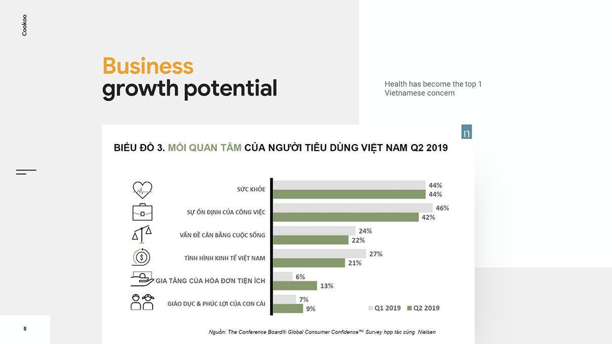
Report from www.nielsen.com
2. E-commerce grew rapidly (but not direct in-app purchase)
78% of internet users aged from 16 to 64, who report each activity in September 2019, purchased a product or service online. E-commerce spent for food and personal care in January 2019 was $348 million. Subsequently, adding e-commerce for fresh food category into the app is, by time, the trend and a relevant choice.
However, in-app purchase is not going to be popular soon in Vietnam (accept for gaming app), since it’s reported that Vietnamese doesn’t like to make pre-paid online purchase.
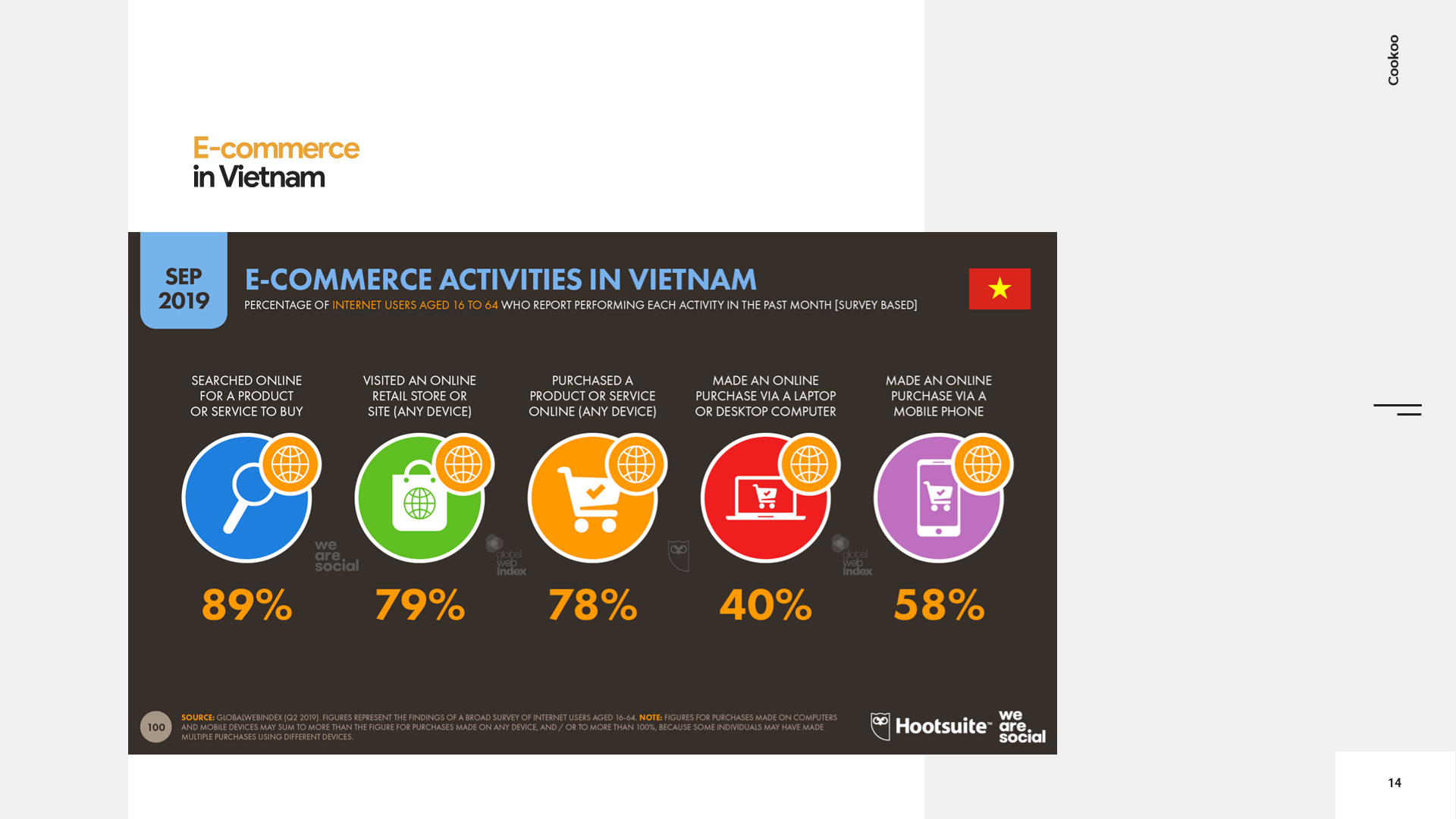
Report from Datareportal.com
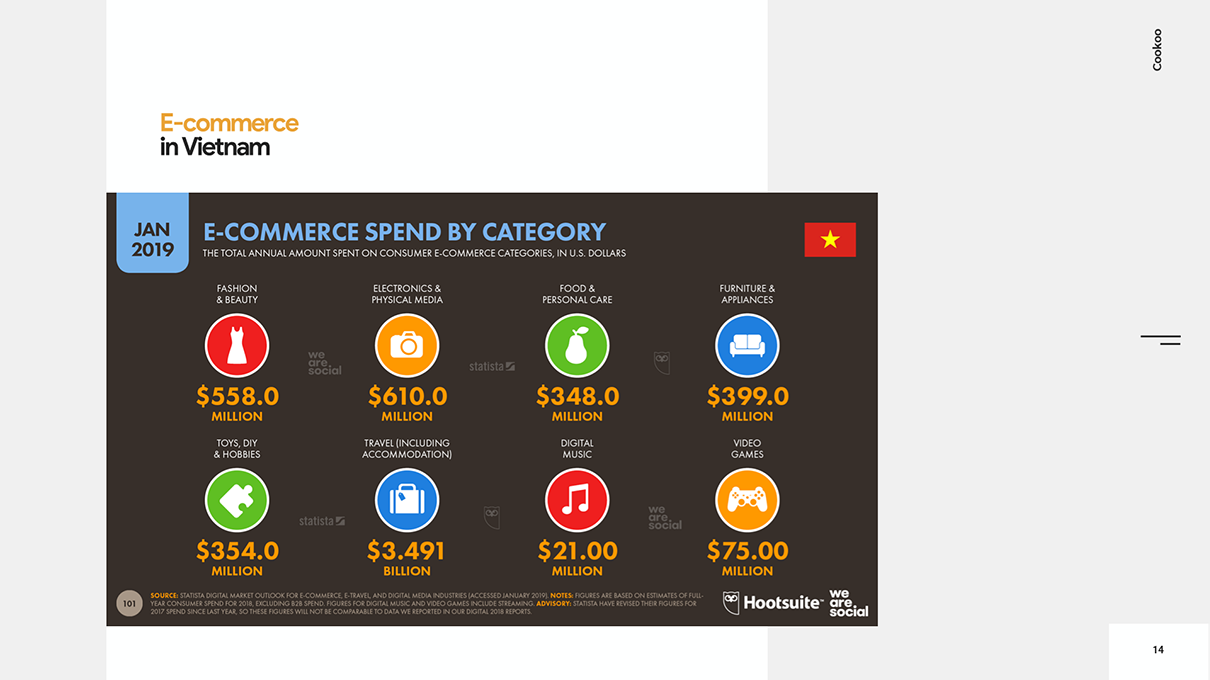
Report from Datareportal.com

Pros and cons of some business model in Vietnam
3. Cooking apps in Vietnam and global region
There have already been a few popular cooking app in Vietnam already. However, only Cookpad seems to have neat task flows and simple UI, but its target users are different from ours. Yummly is a good reference to look after. I learned to use AI tech in the app from Yummly.
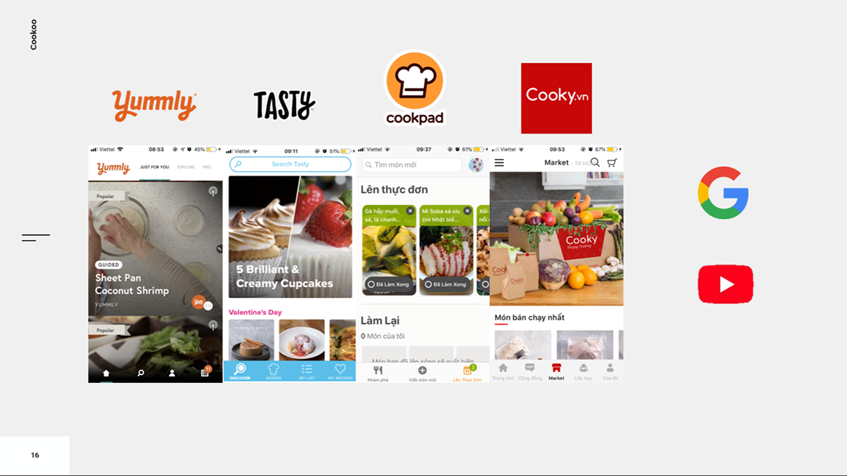
The competitors that were analysed
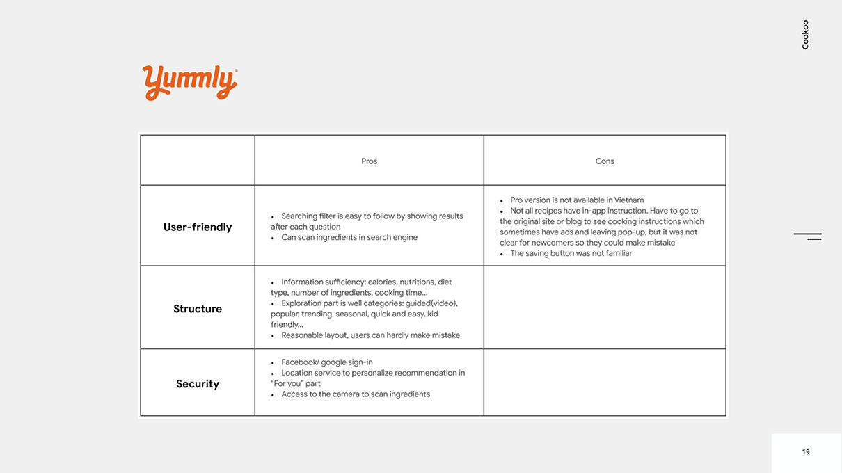
Yummly analysis
Survey and interview
There were many factors needed to be firgured out in the first survey and interview:
Targets that scaled down to ages and backgrounds
People’s cooking habit
What problems they have while cooking
And is there anything we could help with their diets (since people care about health so much these days)
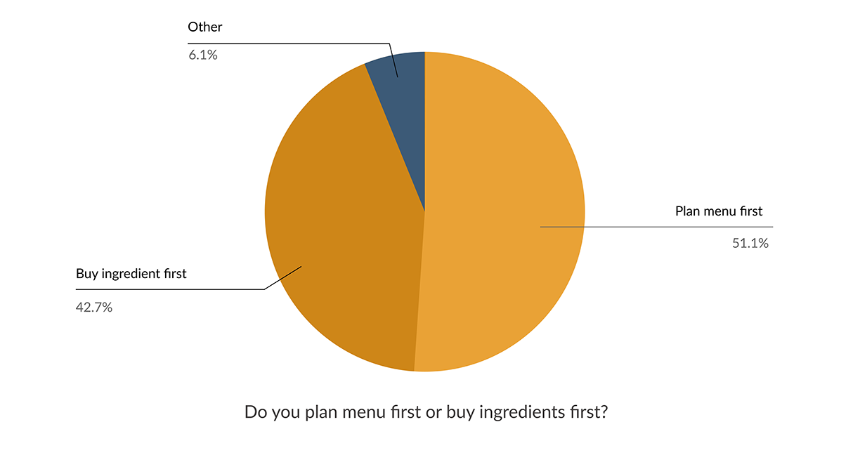
One question from our survey in March 2020
This question broke down our users into 2 big personas with different user journey: one plans first, and one buy ingredients first.
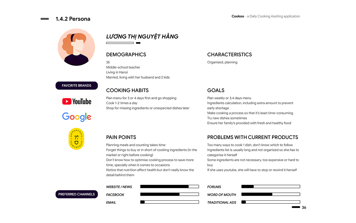
Persona 1
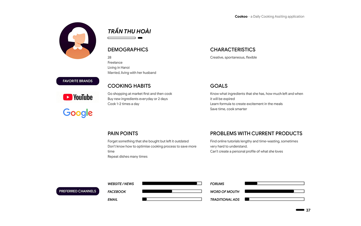
Persona 2
App overview
3 main parts of Cookoo app are Menu, Storage, and Explore. Other addition parts are Shopping list and Saved collection.
At first, I was very excited in the idea of having weekly package ingredient as some kind of e-commerce in the app, yet, it was too ambitious to include such huge area (potentially becoming a complete e-comerce platform after my lecturer’s review) so I decided to put it away after a long time of consideration.
1. Taskflows are the most invested elements
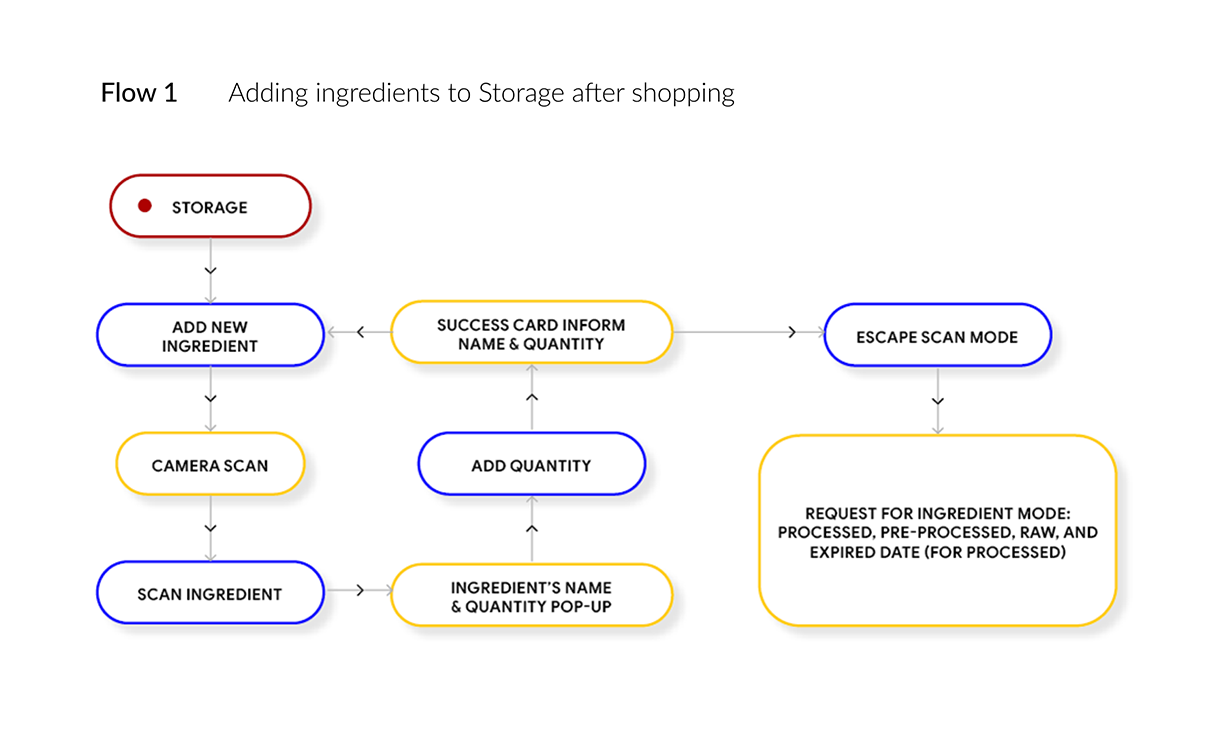
The shorter and efficient taskflows become, the better of user experience it is, so I focused on taskflows every time I need any design adjustment. Following taskflows would be sitemap and user interface.
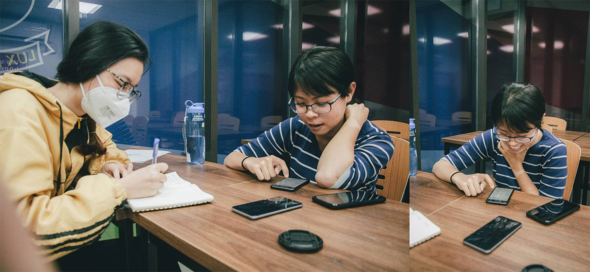
Me doing user test - taken by my teamate
2. Prototype
Try some task on our Figma prototype to find out more (better try on laptop or tablet):
Add new ingredients to Storage by camera
Search for new recipe by 2 ingredients
Plan a new menu
